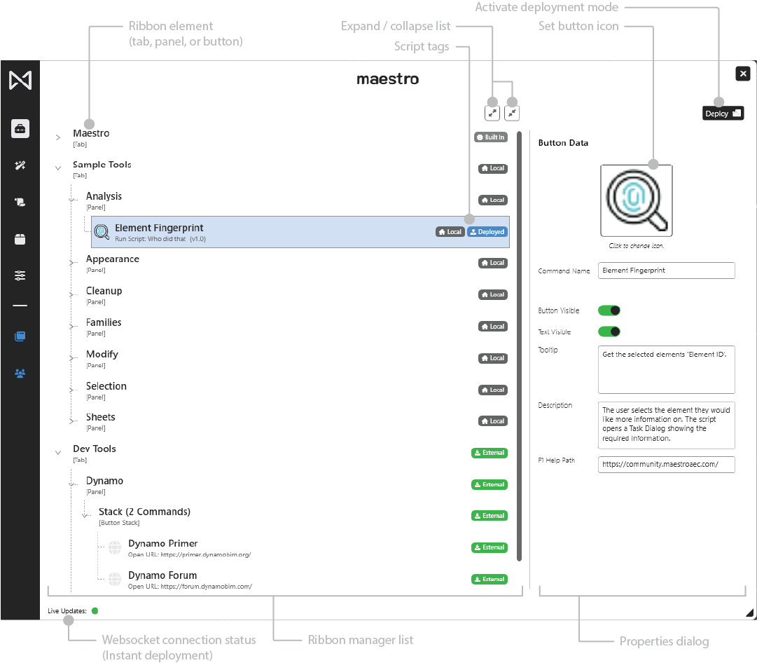
The Ribbon Manager Panel is where users design, organize, and configure the custom Revit ribbon layout used in Maestro. This includes tabs, panels, buttons, and button stacks. It provides complete visual control over how tools appear inside Revit.
4.5.1 Overview
The Ribbon Manager allows users to:
- Create and organize custom ribbon tabs
- Add and manage panels
- Create buttons for scripts, files, folders, and URLs
- Define button stacks (up to three buttons)
- Configure button metadata (icons, names, tooltips, descriptions, help paths)
Standard enterprise users can view ribbon elements but cannot enter deployment creation mode.
Deployment creation is restricted to Enterprise Super Users.
4.5.2 Ribbon Hierarchy
Ribbon elements follow a strict structure:
Ribbon
└── Tab
    └── Panel
         ├── Button
         └── Button Stack (2–3 Buttons)
Tabs contain panels, and panels contain buttons or button stacks.
ASCII Diagram
Ribbon
└── Tab
    ├── Panel
    │   ├── Button
    │   └── Button Stack
    │       ├── Button
    │       ├── Button
    │       └── Button
    └── Panel
        └── Button
4.5.3 Tabs
Tabs are the highest-level elements in the ribbon.
Actions
- Create new tabs (right-click blank space)
- Rename tabs
- Delete tabs
- Add panels beneath a tab
Tab Context Menu
- Rename
- Add Panel
- Delete
4.5.4 Panels
Panels group buttons and stacks within a tab.
Actions
- Create new panels under a tab
- Rename or delete panels
- Add buttons or button stacks
Panel Context Menu
- Rename
- Add Script
- Add Folder Link
- Add File Link
- Add URL Link
- Delete
4.5.5 Buttons
Buttons are actionable ribbon tools. They may run scripts, open files, open folders, or navigate to URLs.
Actions
- Rename buttons
- Change button icons
- Toggle visibility
- Edit associated scripts
- Delete buttons (when not deployed or protected)
Button Context Menu
- Rename
- Toggle Visibility
- Change Icon
- Edit Script
- Delete
Tags
Buttons may include tags:
- Local — Created by the user
- Built In — Included with Maestro
- Deployed — Included in an enterprise deployment
- External — Provided by another user’s deployment
4.5.6 Button Stacks
Stacks create compact, vertical button groups.
Each stack can contain up to three buttons.
Creating a Button Stack
- Shift-select two or three buttons in the same panel
- Right-click
- Choose Create Button Stack
Behavior
- Treats multiple buttons as one element
- Stack metadata is shared at the stack level
- Individual button metadata (script assignment, icon) remains per button
4.5.7 Button Properties Panel
Selecting a button reveals editable properties on the right side.
Icon
Opens an icon selector and supports scalable Maestro icon sets.
Command Name
The text displayed beneath the ribbon button.
Button Visible
Toggles whether the button appears in the Revit ribbon.
Text Visible
Controls whether text is displayed beside the icon.
Tooltip
A short explanation shown on hover in Revit.
Description
Long-form description displayed in Maestro.
F1 Help Path
A URL or file path that opens help documentation or internal resources.
4.5.8 Deployment Mode (Ribbon Manager)
Deployment creation happens inside the Ribbon Manager.
This mode only appears for Enterprise Super Users.
Activation Triggers
- Clicking Deploy (create deployment)
- Clicking Modify on an authored deployment
Orange Border Indicator
A thick orange border surrounds the Ribbon Manager when deployment mode is active.
Critical Rule
Only buttons have checkboxes in deployment mode.
Tabs and panels do not.
Checkbox Meaning
- Checked → Include this button in the deployment
- Unchecked → Exclude
Automatic Hierarchy Extraction
Maestro automatically includes:
- The parent panel
- The parent tab
Based solely on the selected buttons.
No empty panels or tabs are included.
Buttons in Multiple Deployments
A button may appear in any number of deployments without conflict.
4.5.10 Best Practices
- Organize tools into functional panels
- Use button stacks to conserve space
- Keep naming consistent across teams
- Avoid cluttering the Maestro tab—use additional tabs for grouping
- Super Users: carefully review selected buttons before committing deployments